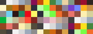
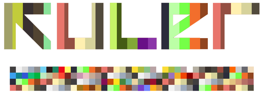
Advanced Web DesignClick the Kuler image below for final design, this will pop out in a new window.
DescriptionThe aim of this unit is to enable students to investigate new developments in advanced web design and the production of new content and delivery methods. Broadband technology allows the delivery of multimedia in many new exciting ways, this unit will allow students to follow new developments and to produce a range of work that will reflect contemporary working methods. Interactive television, hand held devices and the internet utilise converging pathways and there is a common acceptance of multimedia as an enhancement of traditional communications forms. It is intended that students will be able to follow these developments and explore new ways of working to ensure they are ready to meet expected changes within the industry. BriefContent is now massively distributed, individuals and companies now disperse their video, graphics, text across the likes of ‘youtube’, ‘flickr’ and ‘facebook’. How do you organise and structure such content? TaskUsing the relevant, api (explain) pull data such as music tastes, video lists and friend’s lists from sources such as ‘youtube’, ‘flickr’ and ‘facebook’ and create a single page to display them. Your page should be an aesthetic and structured interpretation of the data retrieved that gives the user a visual understanding of the information and the relationships between its component parts. Write UpI am pleased with my final outcome because I stuggled with the workings (code) of how it works but I over came my difficulties and produced a simply yet effective piece. Once I had the tricky part sorted out, which was the code I was easily able to sort out the colour patterns and shapes of my work. You can see all my experiments on my blog, by clicking the link in the red box above. I tried changing the shape from squares to circles and so on to see what would look best. To achieve the word effect that I did above, I made it in Photoshop, then cut out the words and saved as a transparent png. I then put it on the top layer in Flash and the colours just change in the background. |
Best Viewed in Firefox - Adobe Flash Player - Adobe Reader Required for site Content - Click to Download - Copyright © benmgiles.co.uk MMIX

